Project info
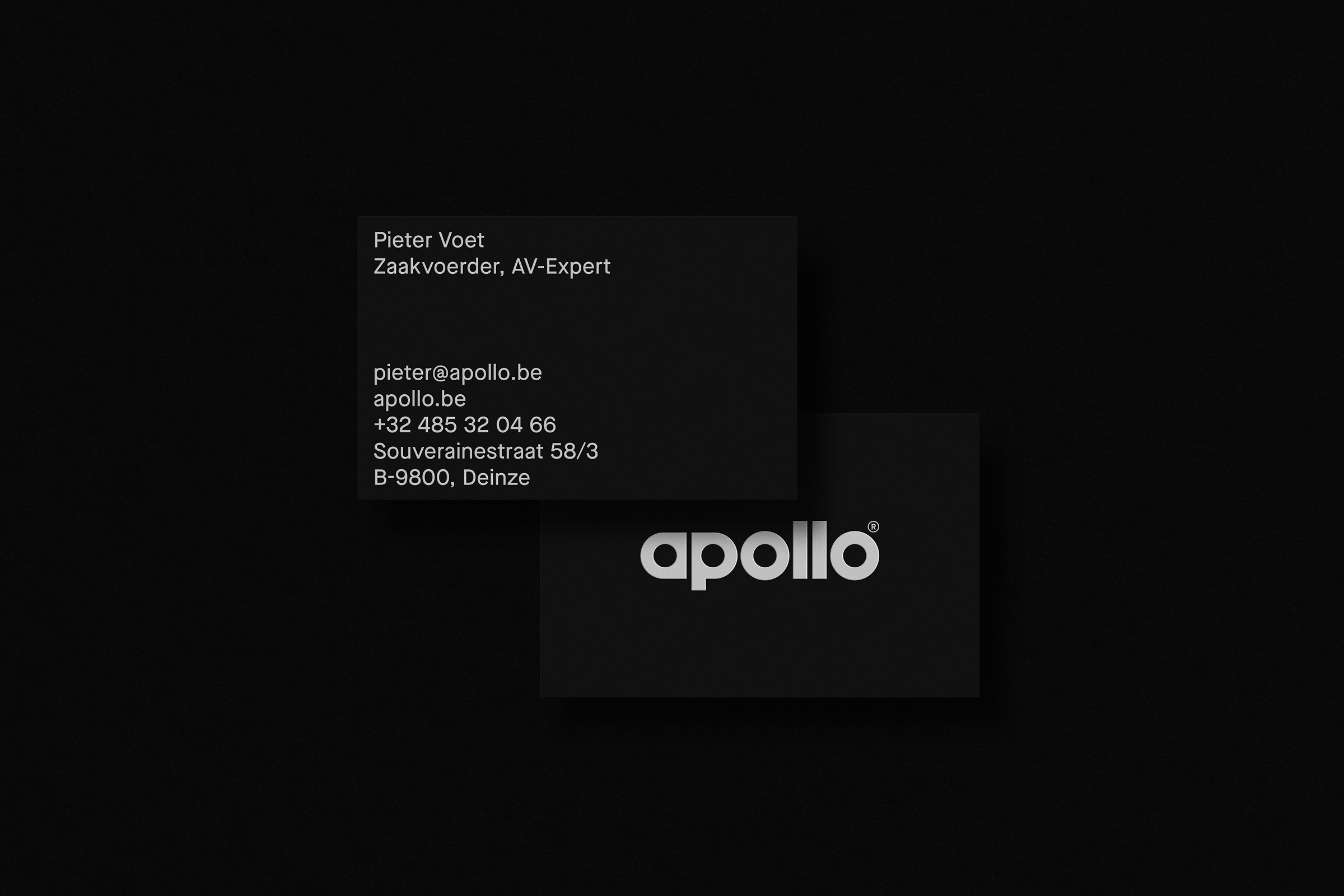
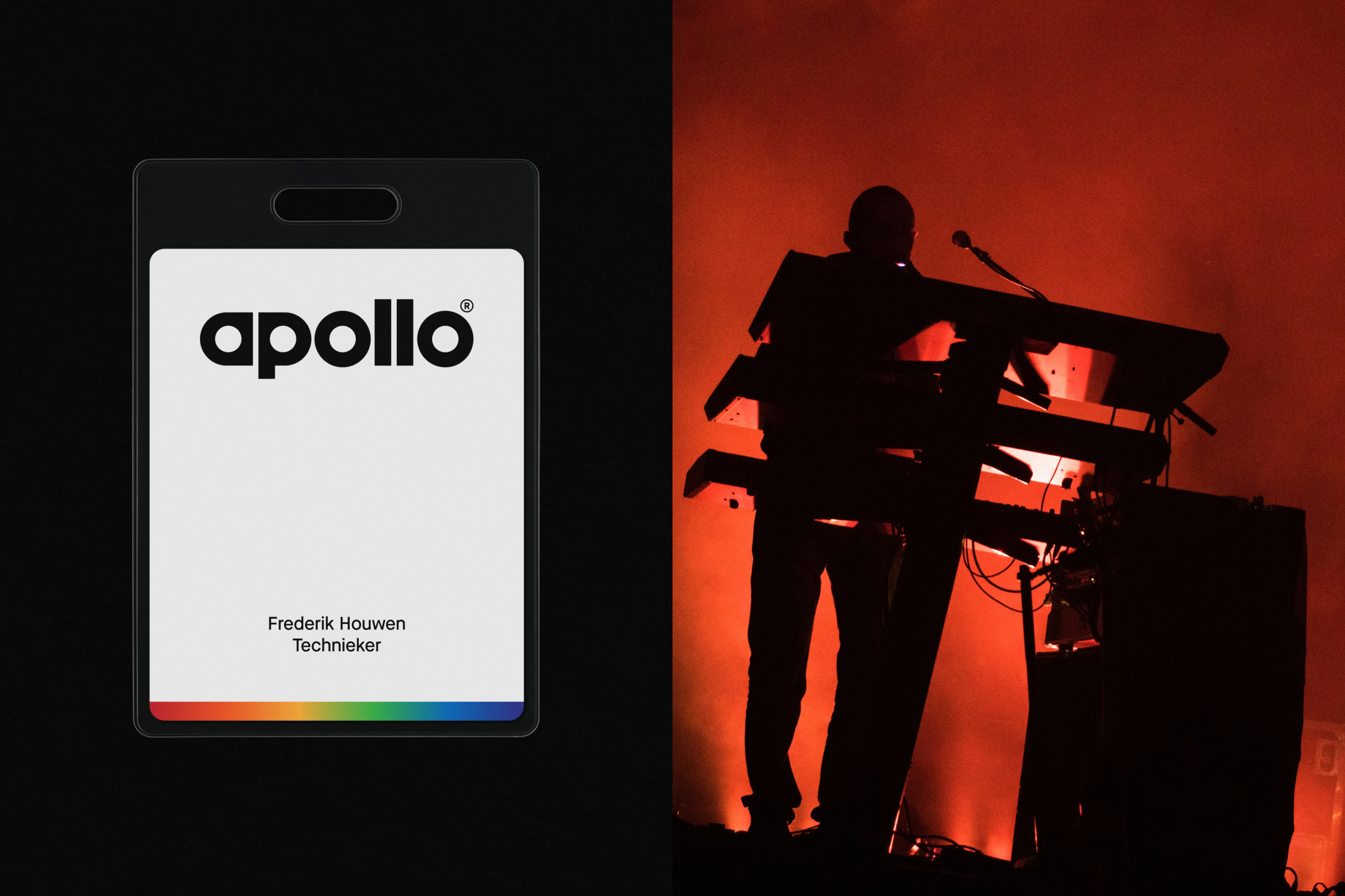
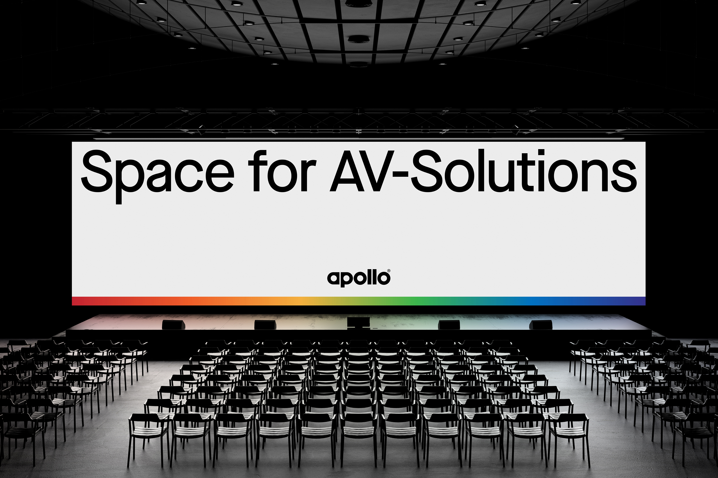
Apollo is an audiovisual company where sound, light, and vision merge into one seamless experience. As the company evolved from a local AV installer into a confident industry challenger, it needed a new name and identity that reflected its growth, credibility and expanded ambition. The new brand introduces a sleek monochrome language featuring the concept of a Seamless Flow – mirroring Apollo’s ethos of precision, continuity, and technical excellence. The rebrand resulted in a distinctive identity that sets Apollo apart in a crowded market, often perceived as traditional and uninspired.
Services
Naming, Identity, Direction

Project info
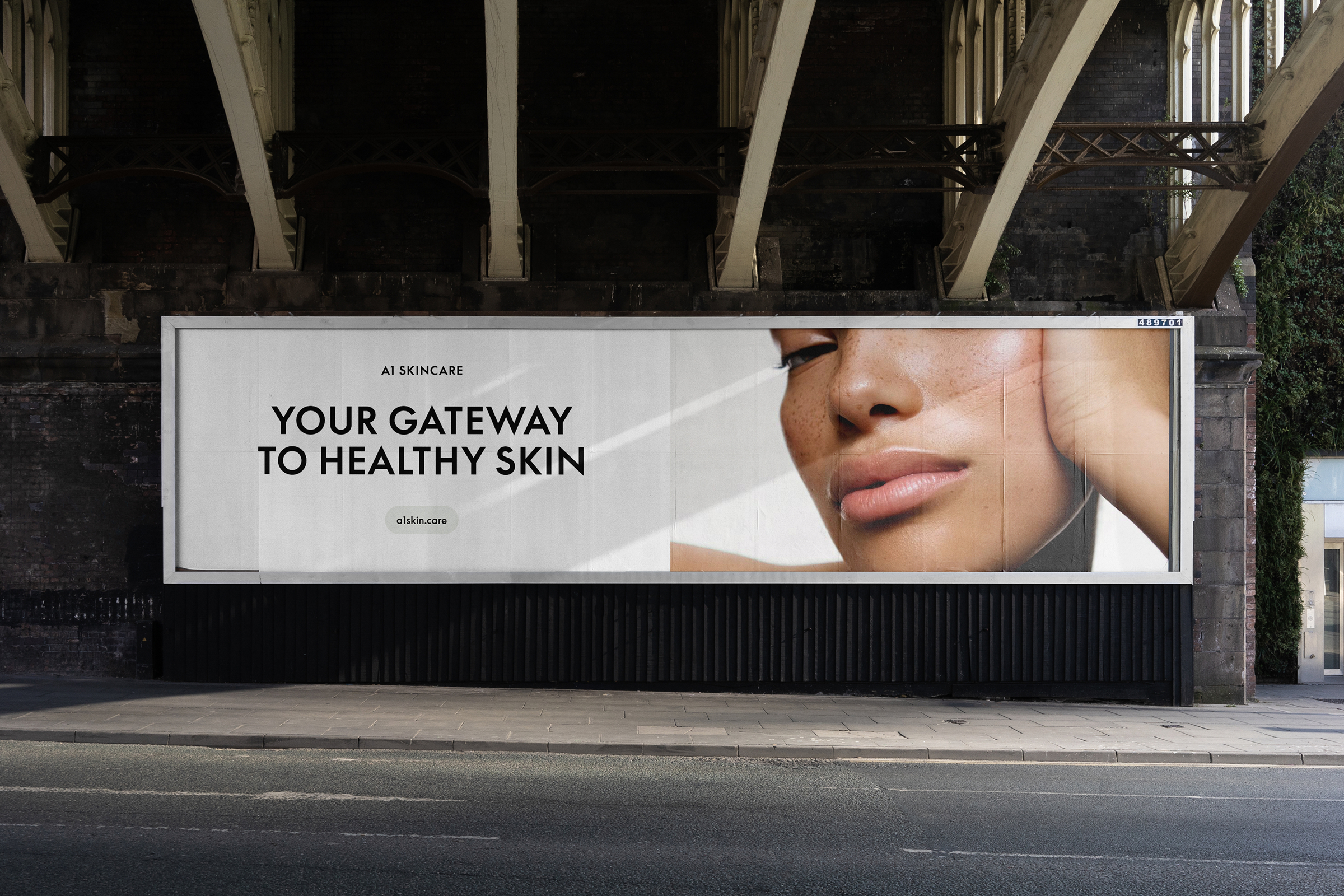
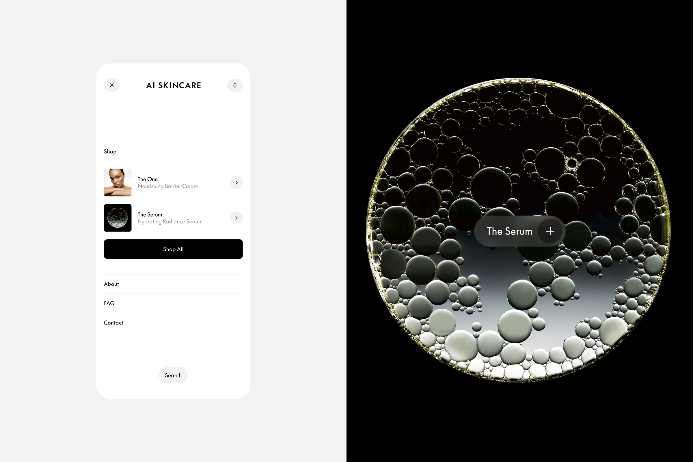
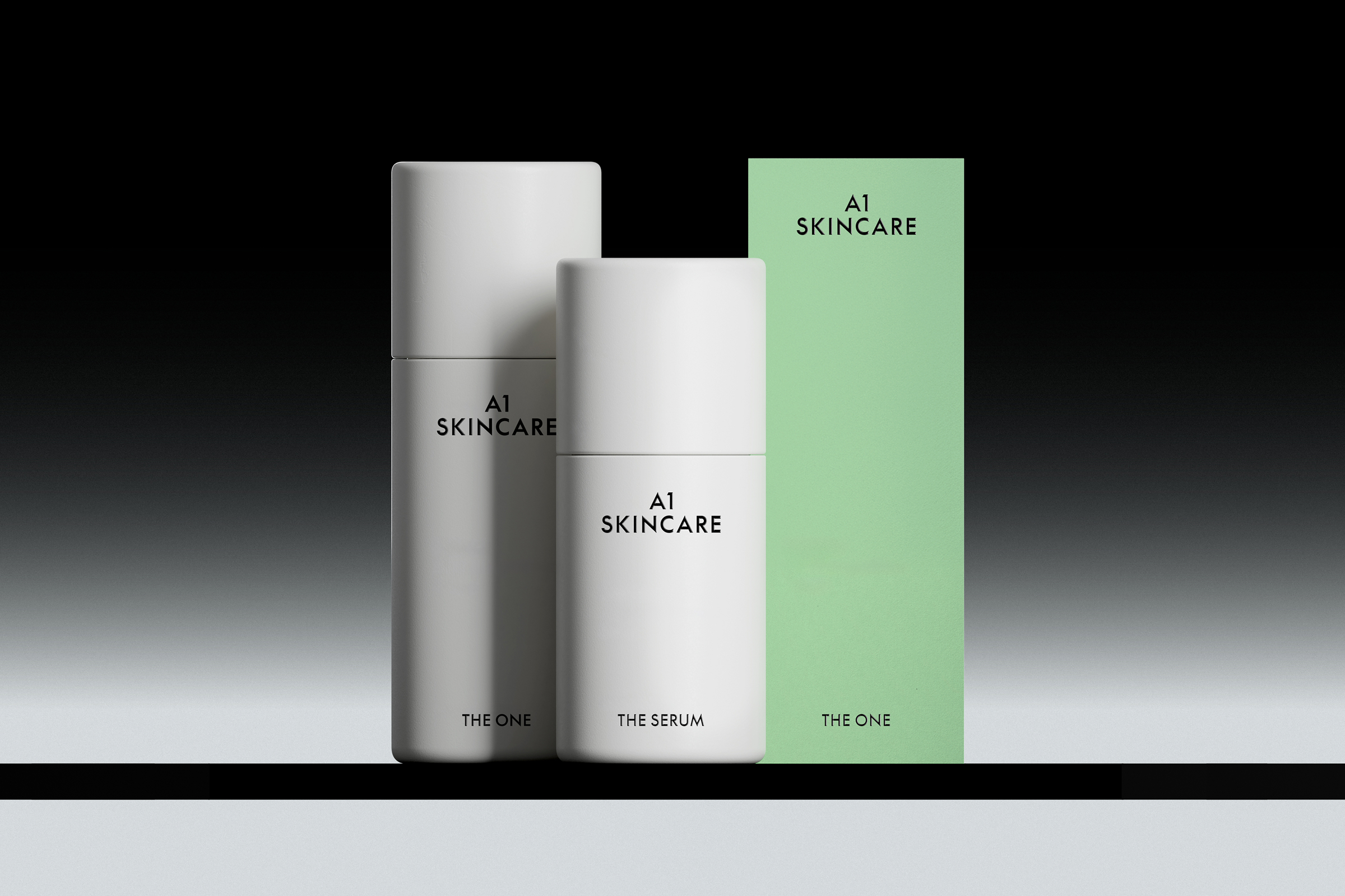
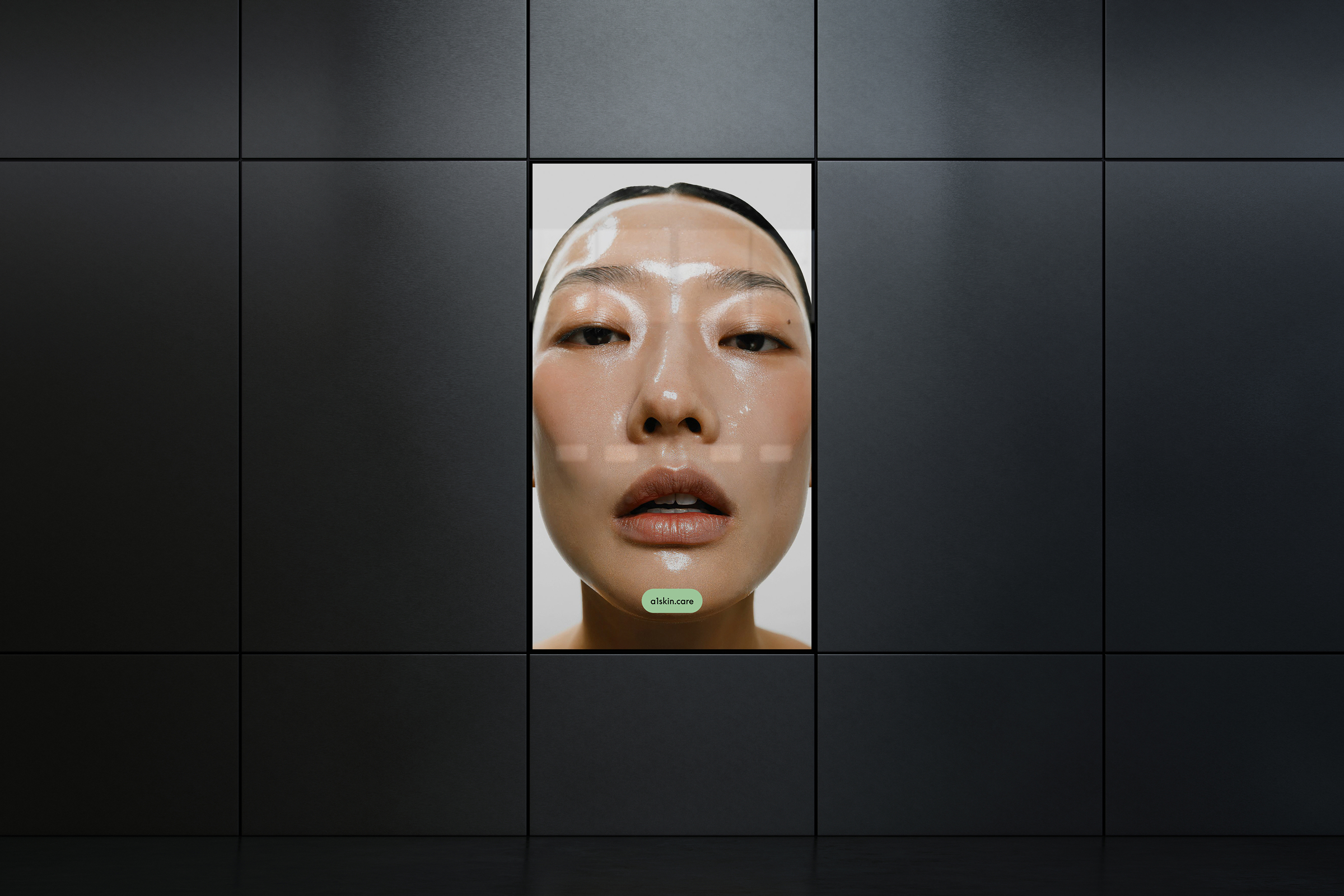
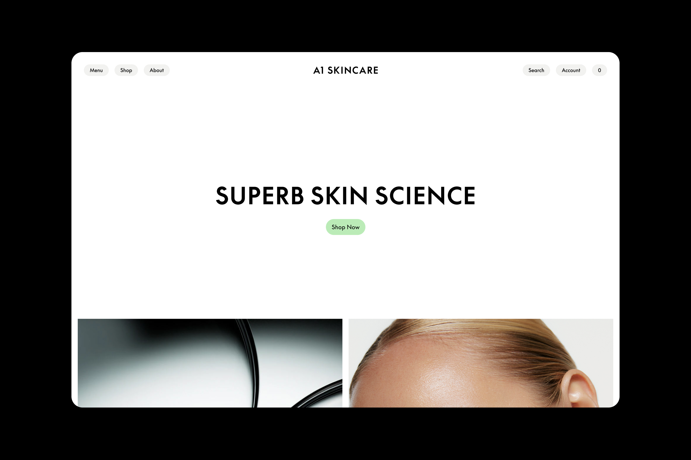
A1 Skincare is a premium skincare brand where cutting-edge science and a deep philosophy of care merge to redefine skin health. The brand identity is built upon the core idea of Superb Skin Science. By celebrating prevention as the ultimate luxury, A1 empowers individuals to shine confidently through understated sophistication. The new identity introduces a balanced and sophisticated visual language, reflecting a clinical and precise, yet human character. The identity positions A1 Skincare as your gateway to healthy skin, transforming daily routines into visible results.
Services
Naming, Identity, Direction


Project info
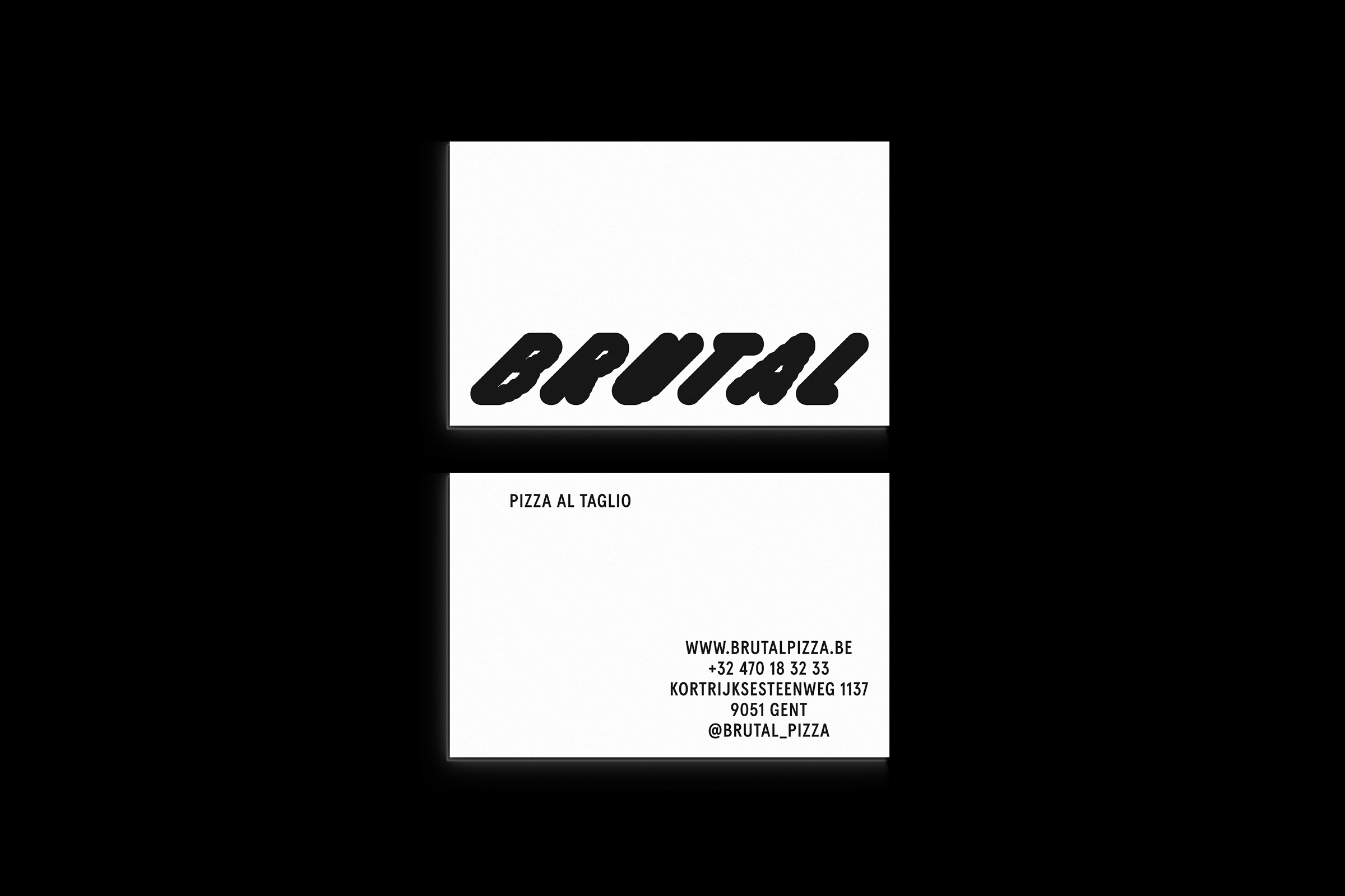
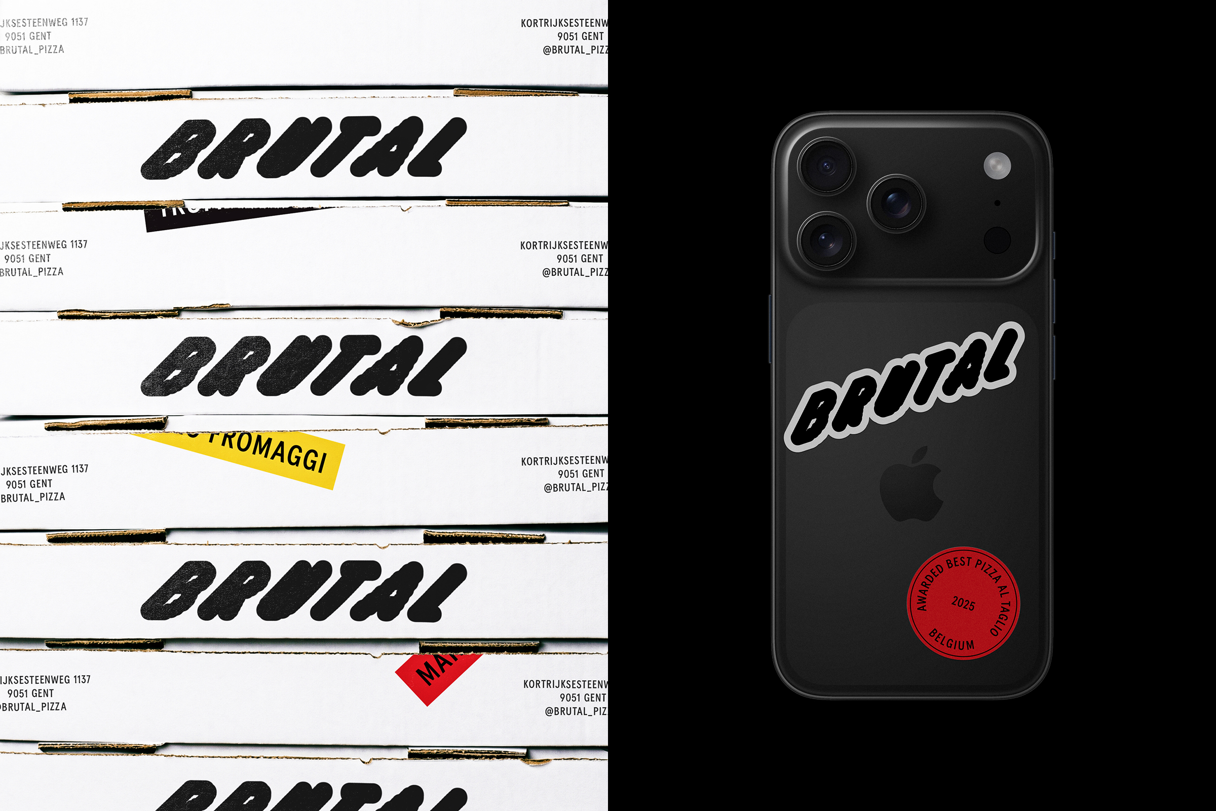
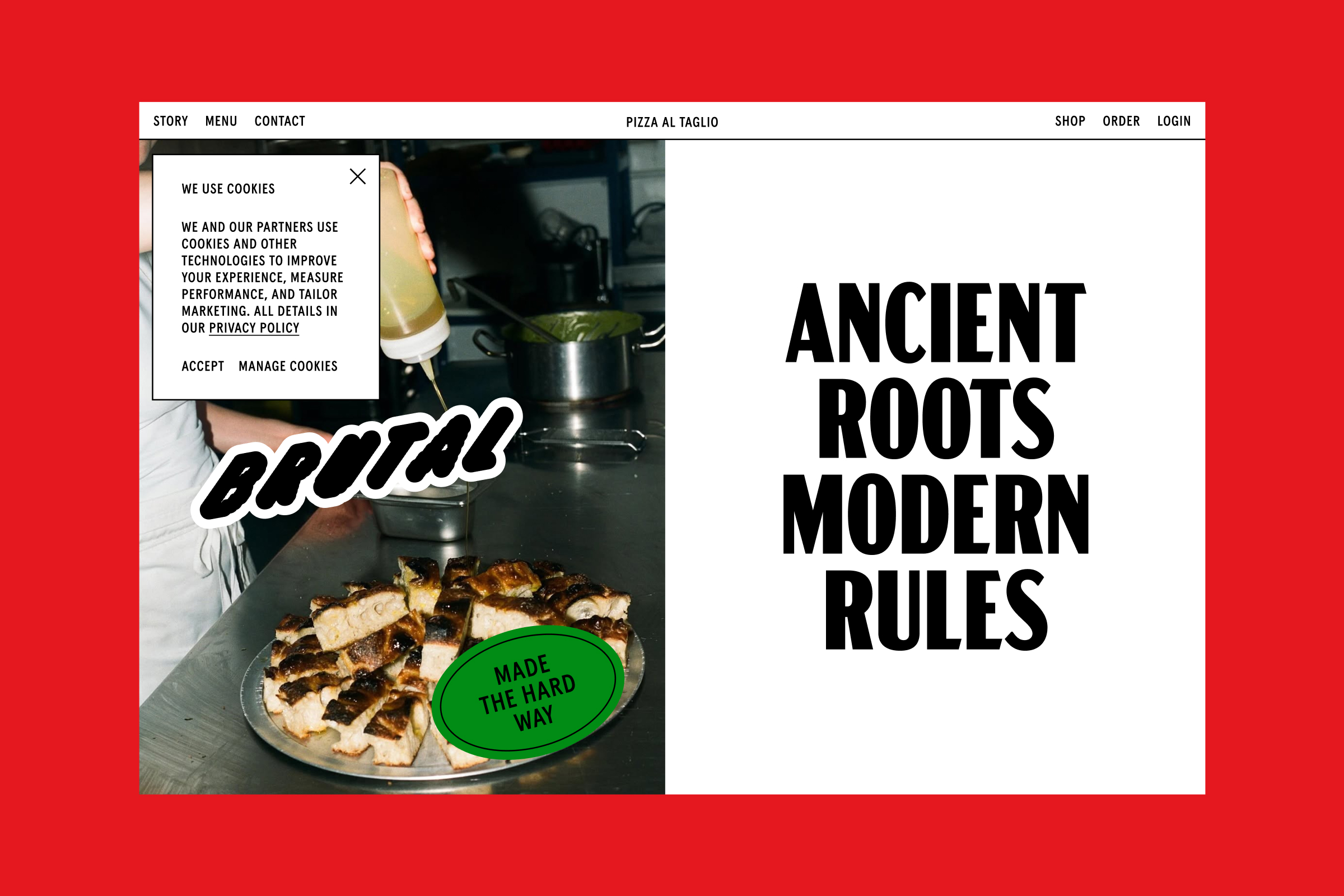
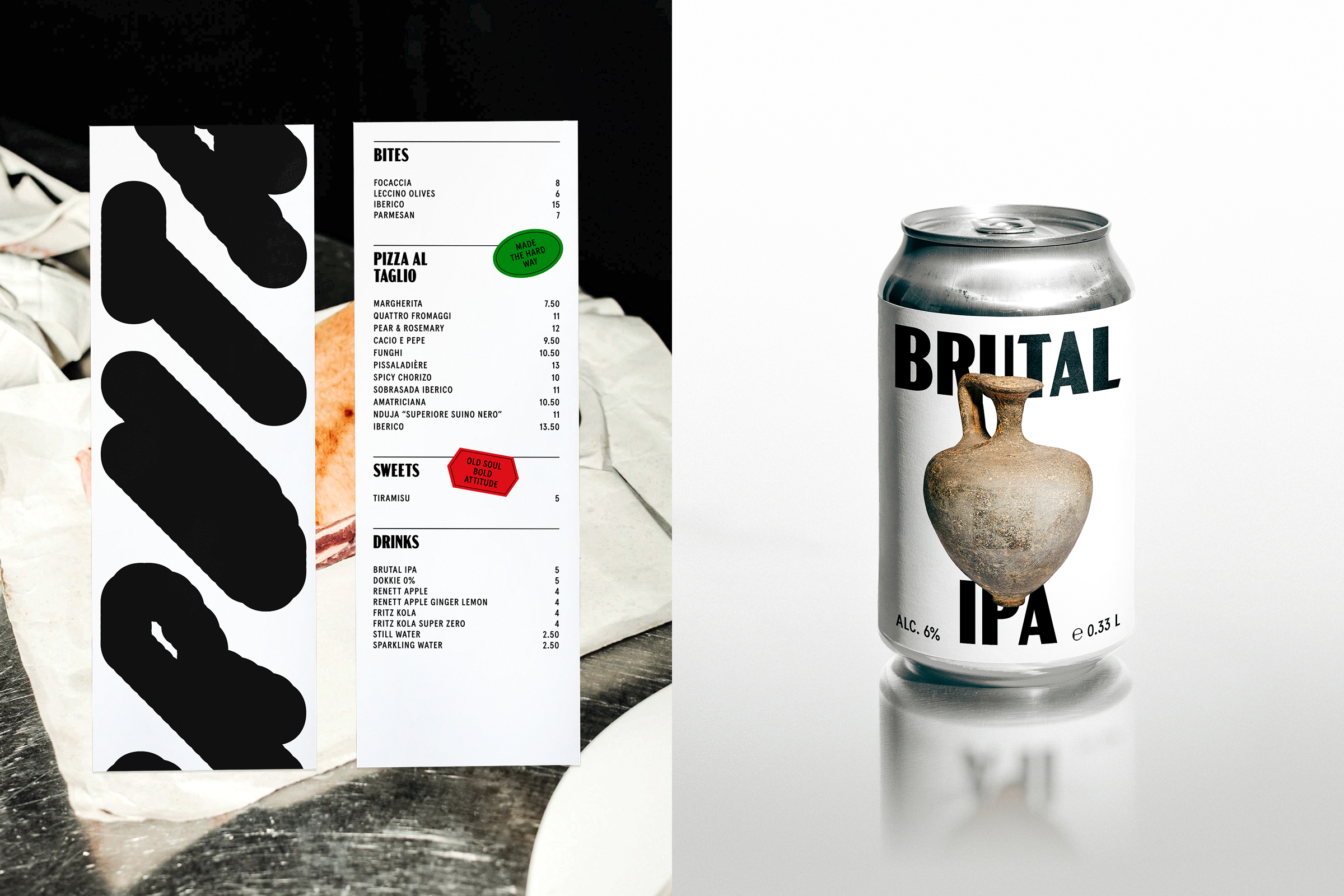
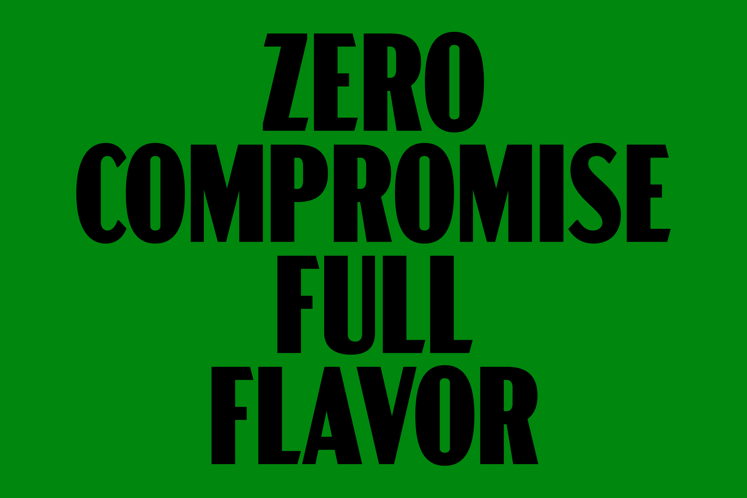
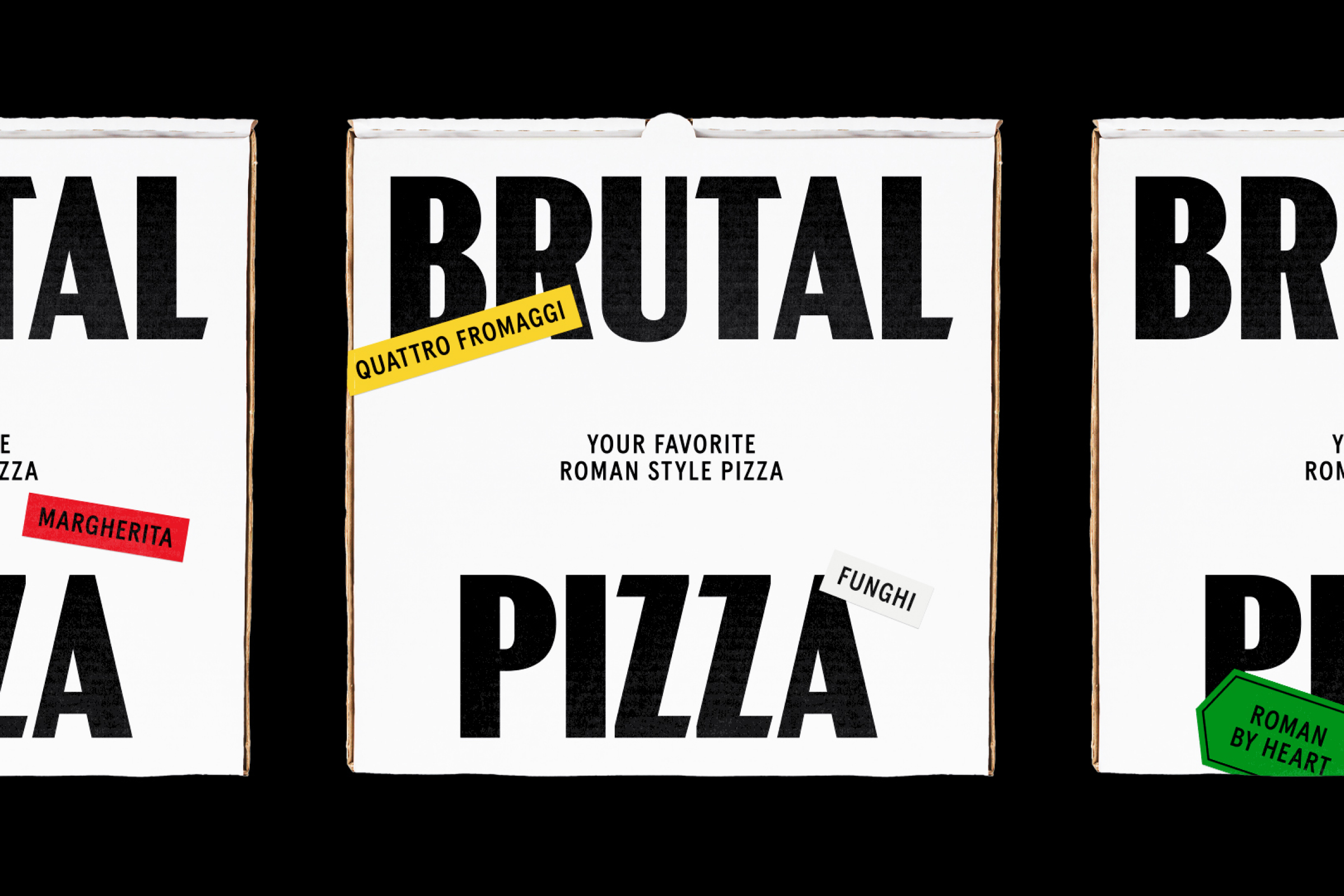
Brutal Pizza al Taglio merges Roman tradition and a rebellious attitude into a unique culinary experience. As the company evolved to redefine pizza as a controlled craft rather than generic fast food, Brutal required a new identity that reflected its uncompromising standards and rebellious spirit. Heritage with Attitude became the North Star of the brand. The rebrand results into a distinctive, raw, and impactful identity that breaks away from industry clichés, positioning Brutal as a bold alternative to the soulless, volume-driven chains that have long defined the pizza landscape.
Services
Tone-of-voice, Identity, Direction
Project info
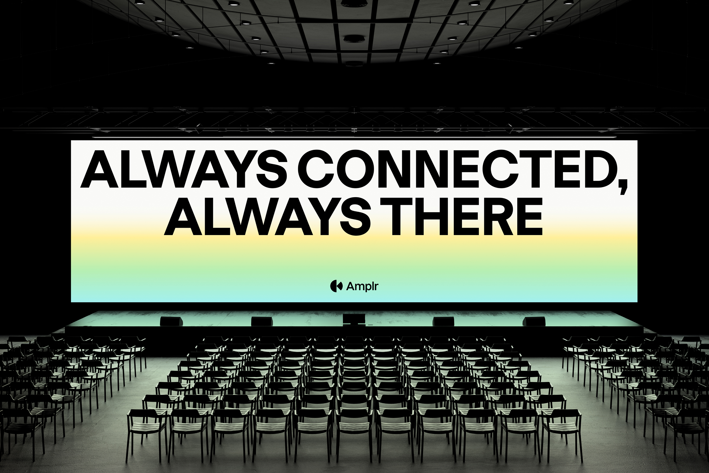
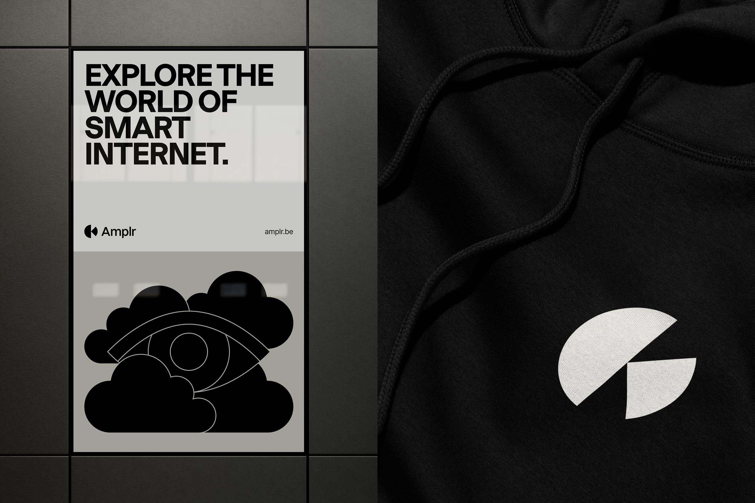
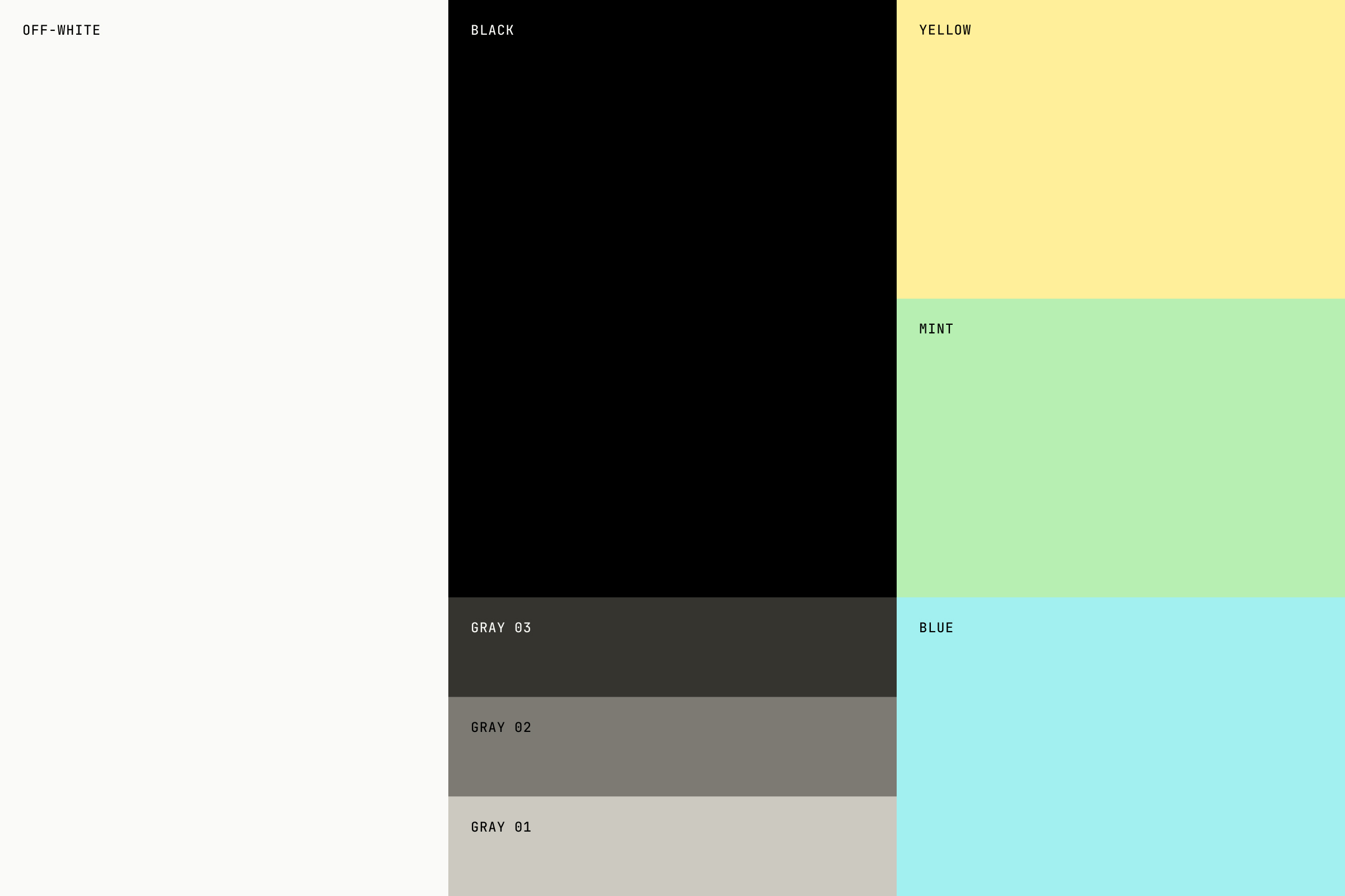
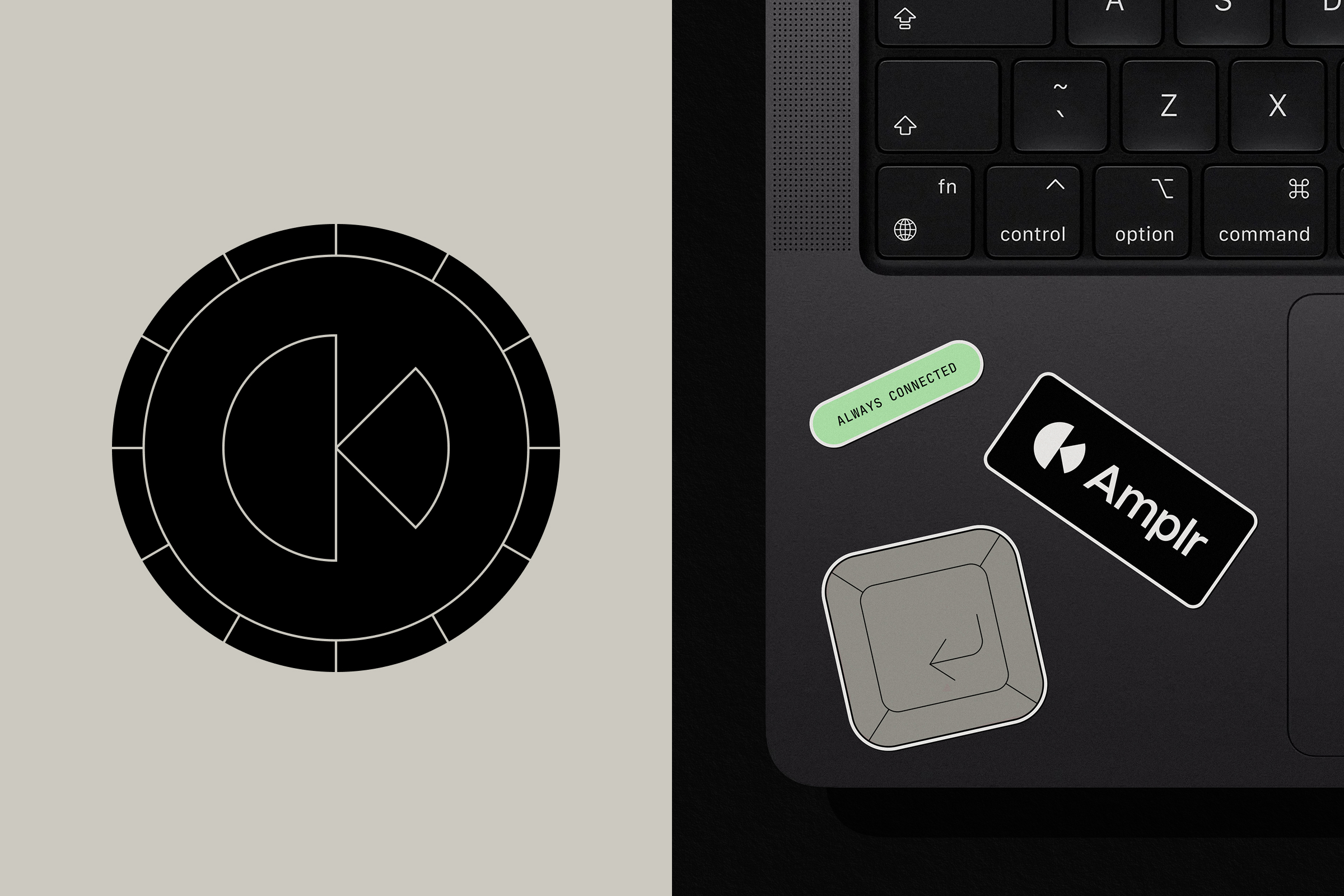
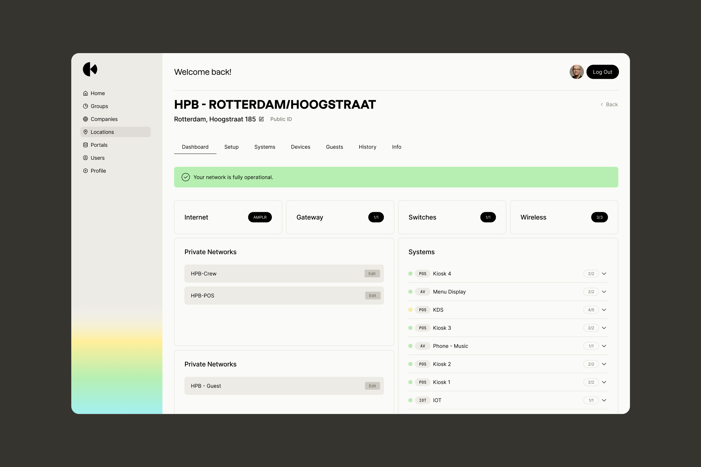
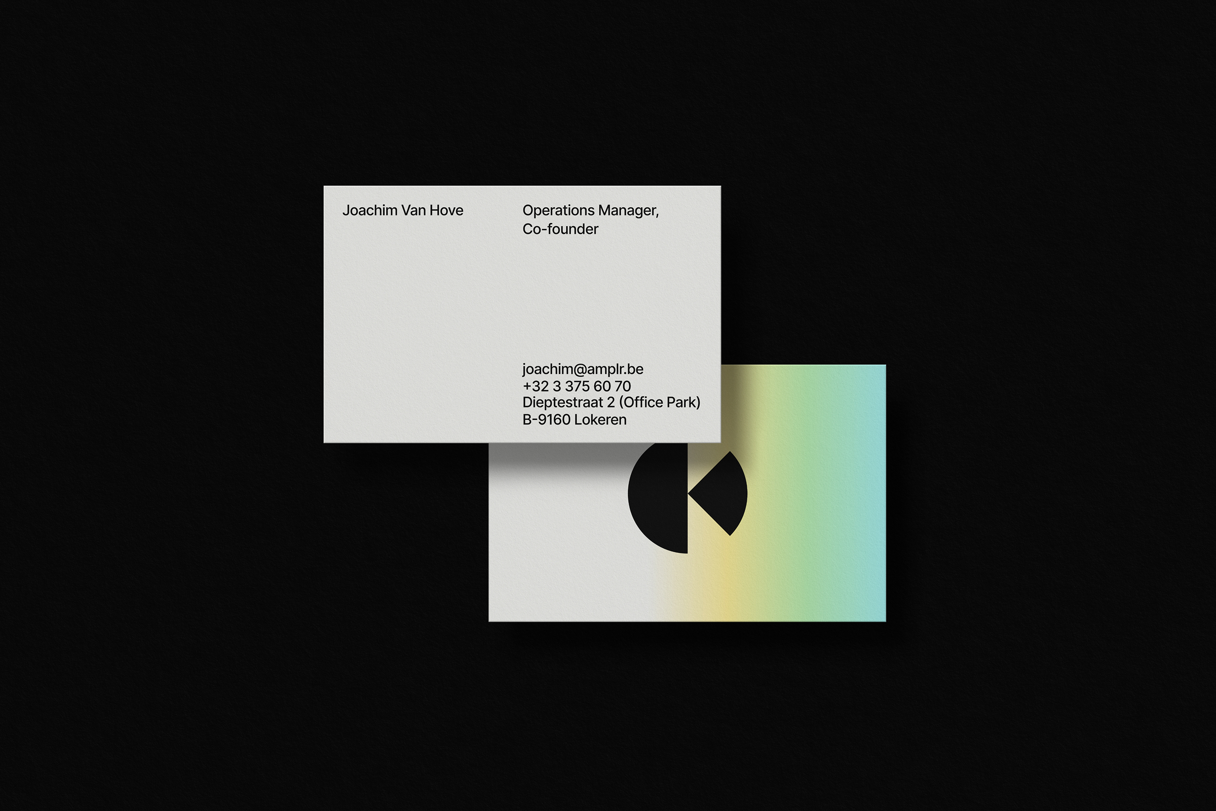
Where technical resilience and human proximity meet, you find a partner dedicated to unbreakable connectivity. Moving beyond its startup roots, Amplr required a new identity that could signal a new era of professional authority. This transformation is anchored by the philosophy of Always Connected, Always There, reflecting a promise to deliver resilient infrastructure that drives operational efficiency. The identity comes to life through fluid, energetic gradients and a refined design system with a technical edge, capturing the essence of seamless continuity.
Services
Identity, Direction

Project info
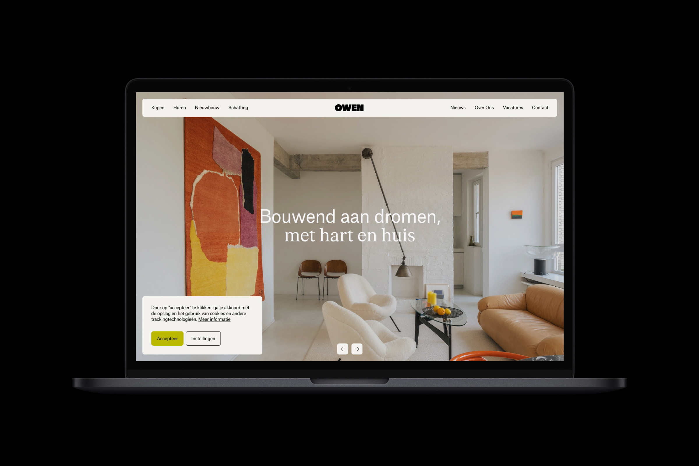
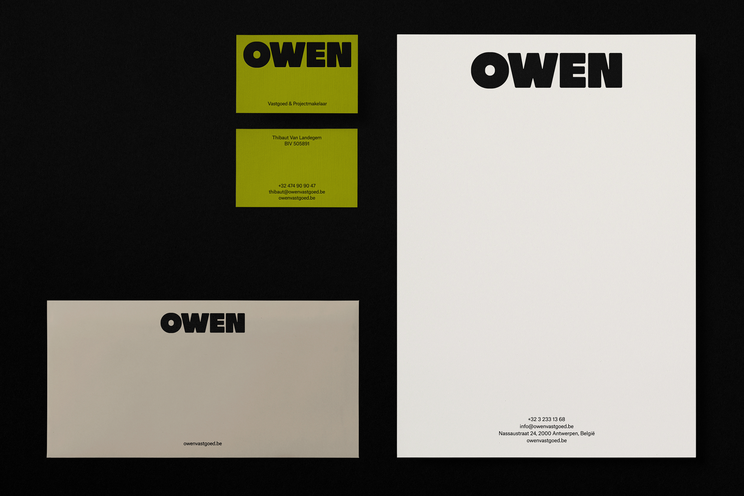
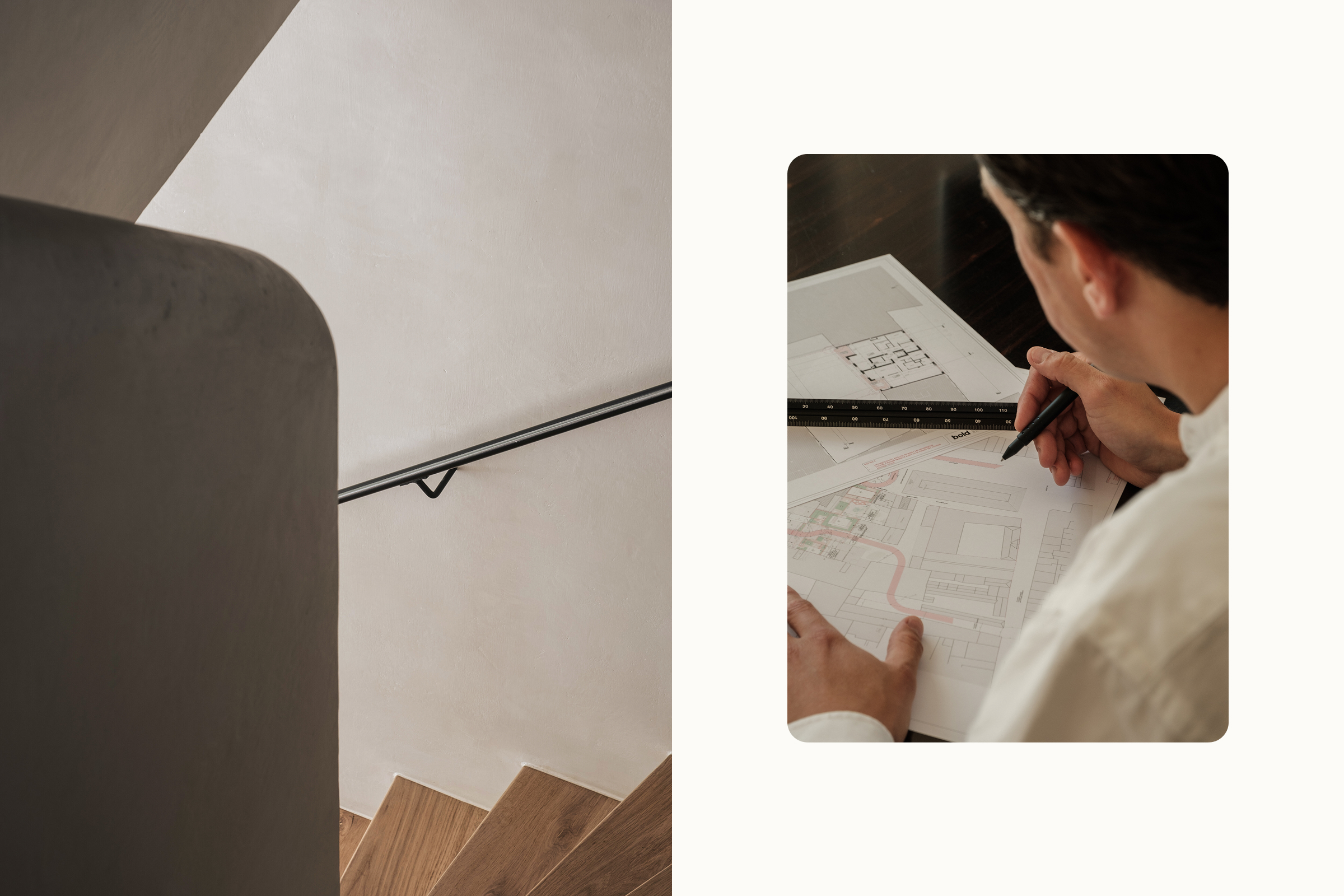
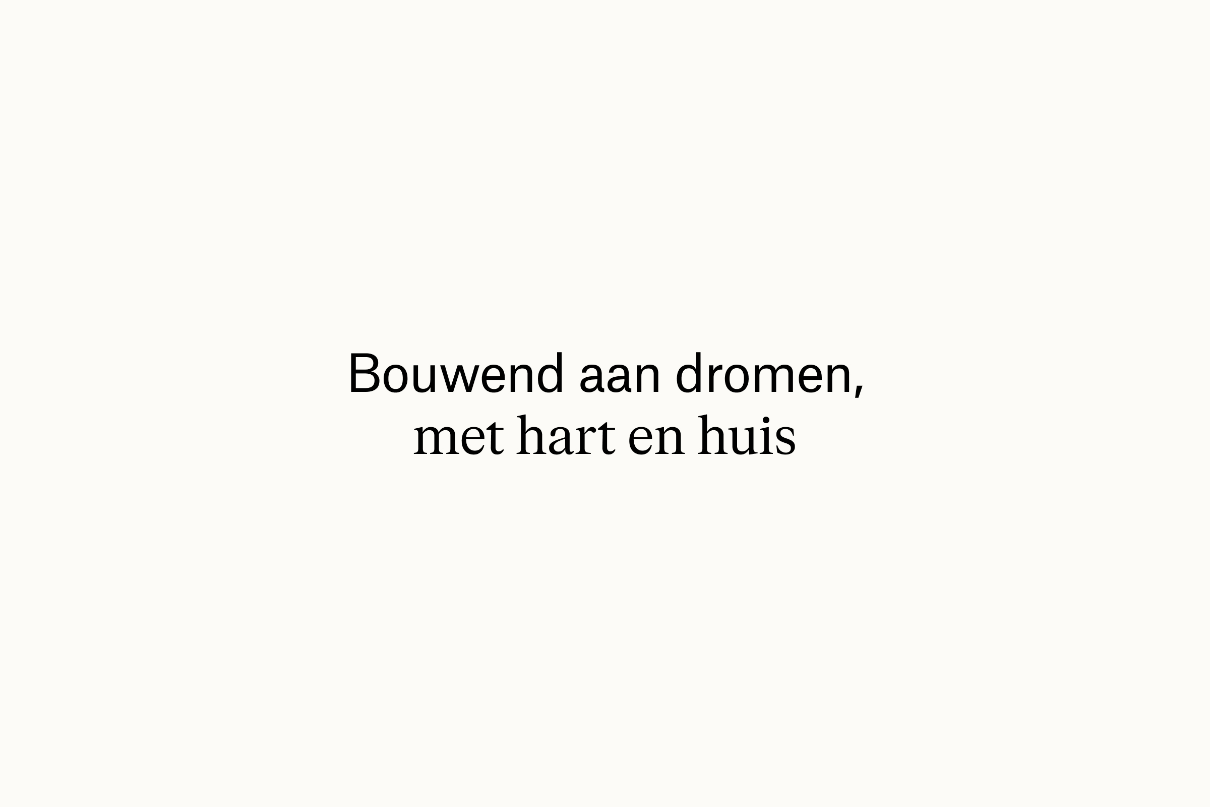
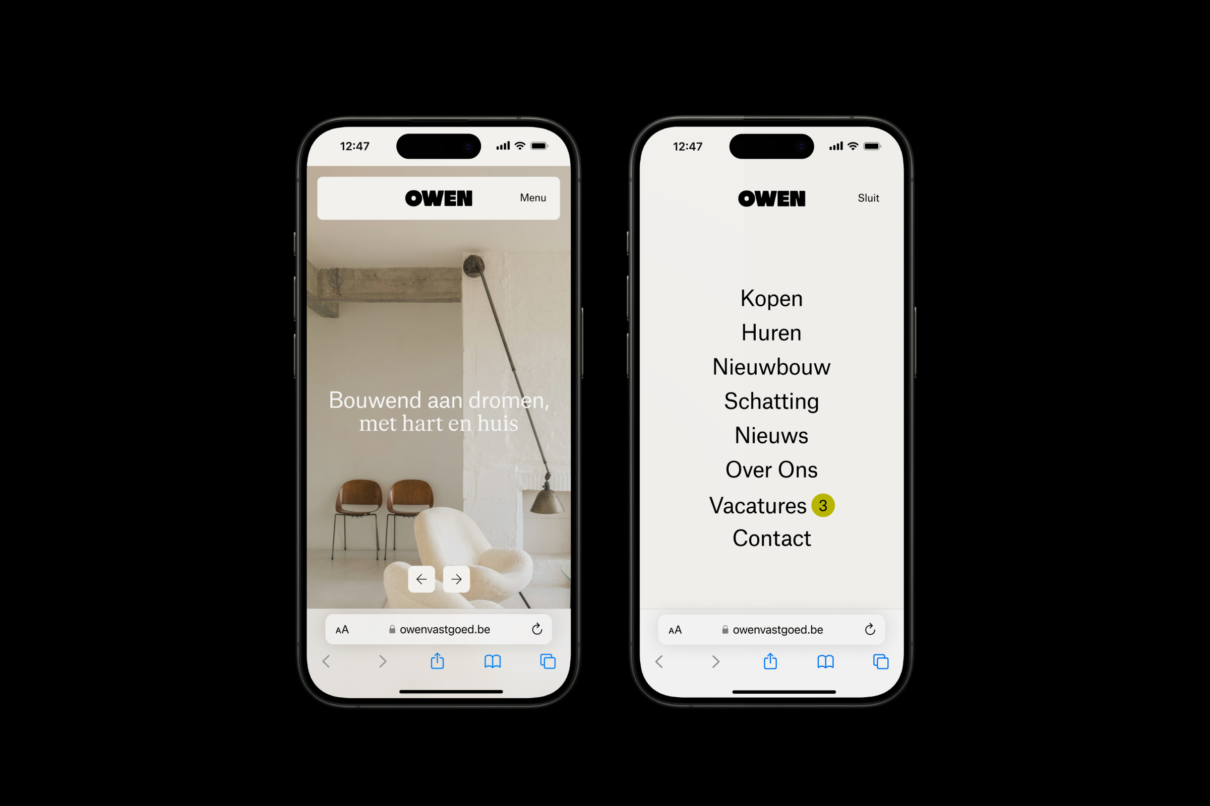
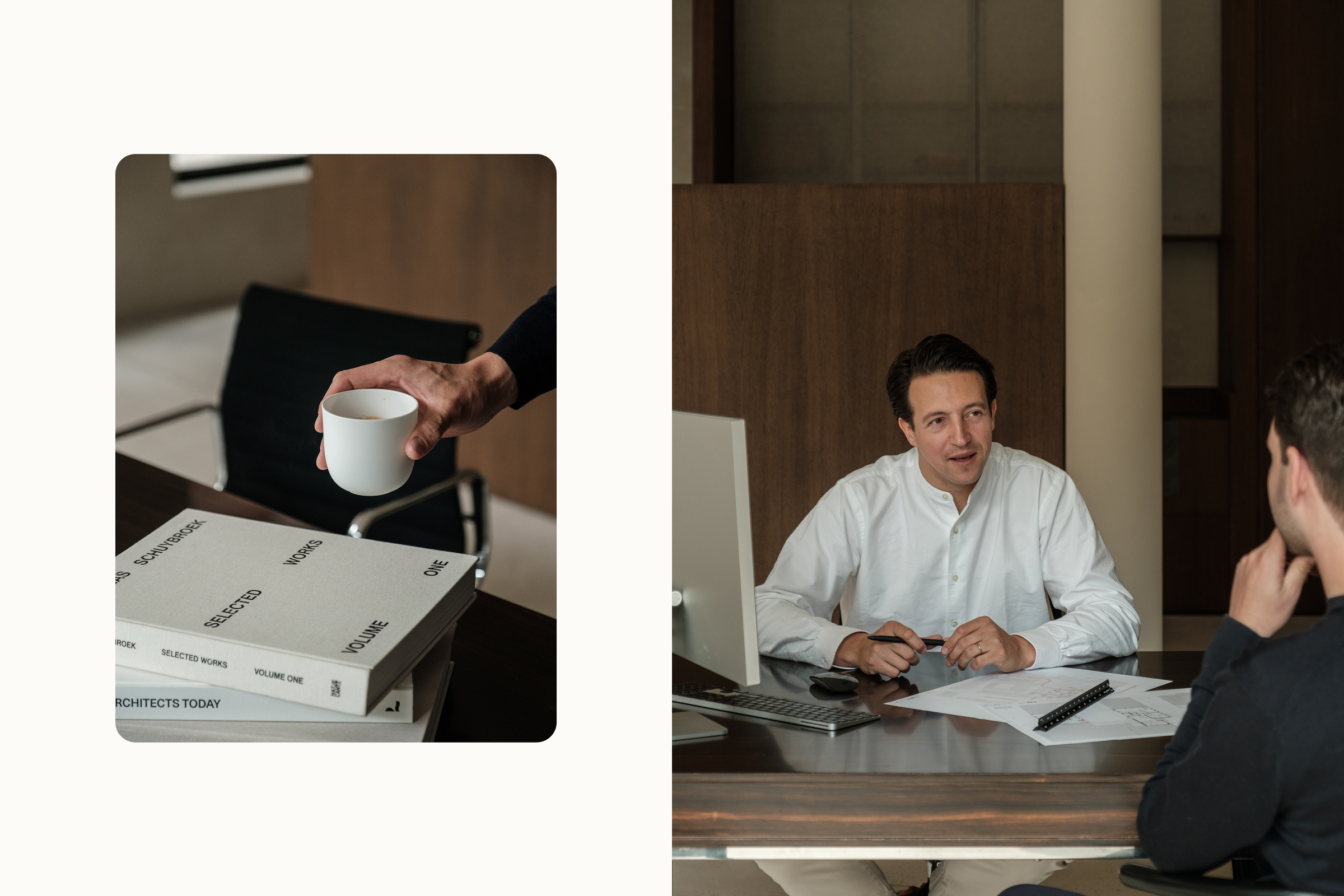
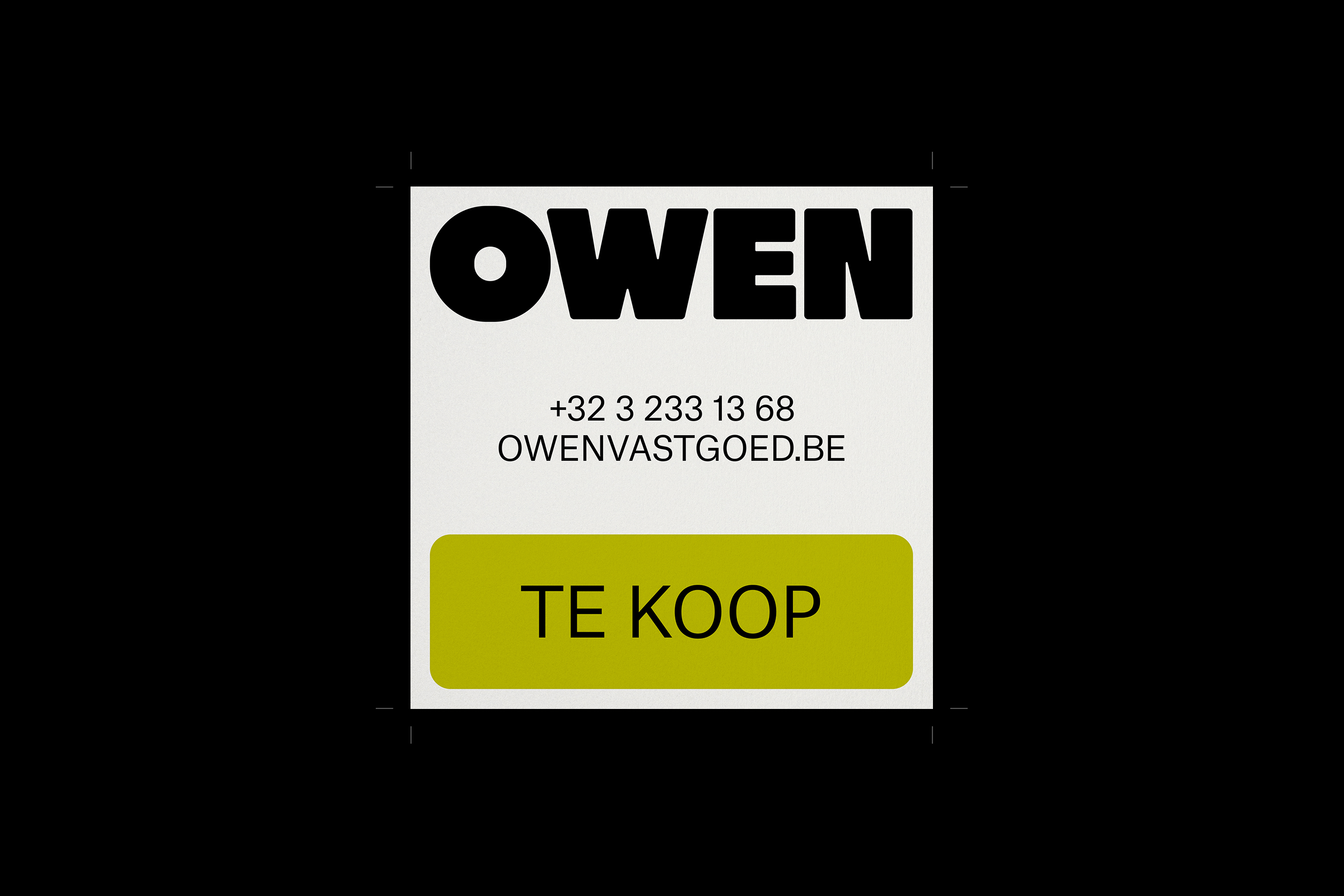
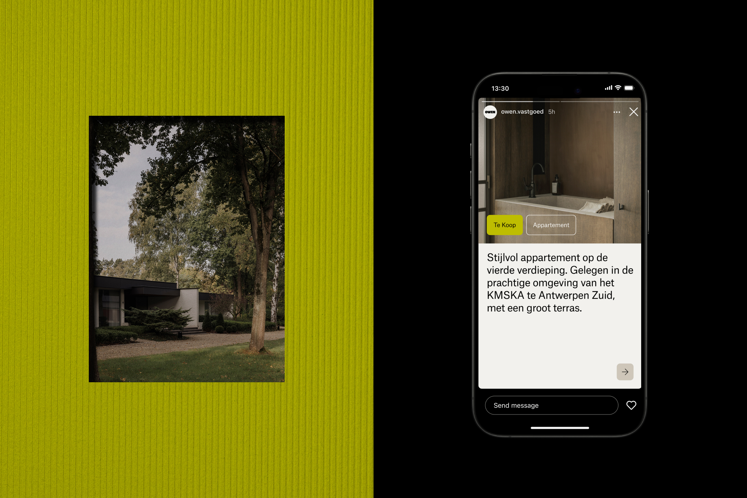
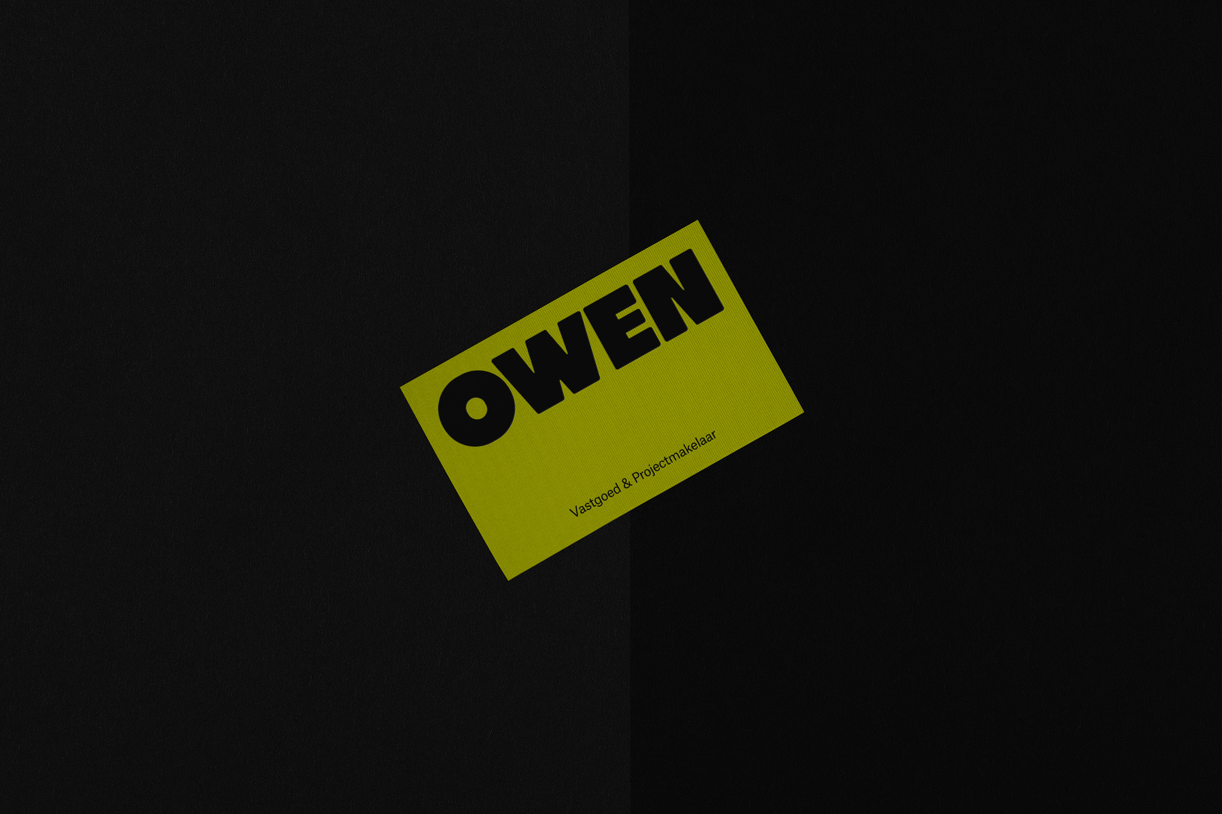
Owen was born from the belief that real estate and property brokerage should be as much about people as it is about plots. Seeking to distance itself from the cold, transactional nature of the housing market, the company required an identity that matched its dedication to personal guidance and aesthetic care. The branding is centered on the promise of “Building Dreams, with Heart and Home,” shifting the focus from mere square footage to the emotional value of a lived-in space. By pairing expert stability and trust with an inviting energy, the identity moves away from rigid corporate norms toward a more grounded experience, positioning Owen as an empathetic partner for those looking for a place to truly belong.
Services
Naming, Identity, Direction
Project info
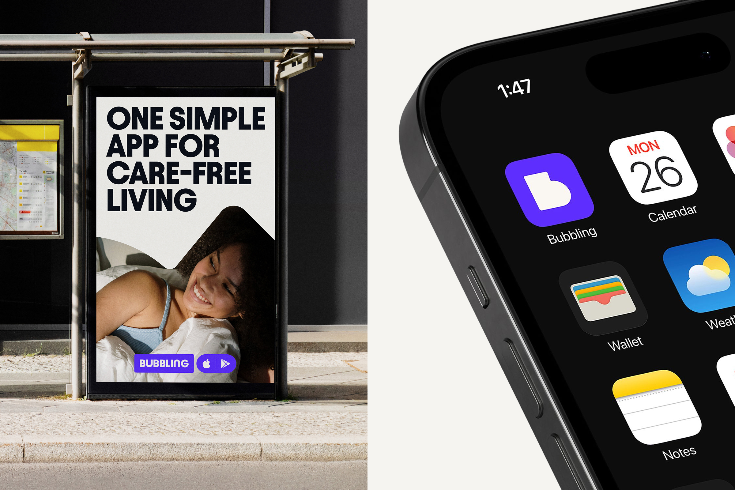
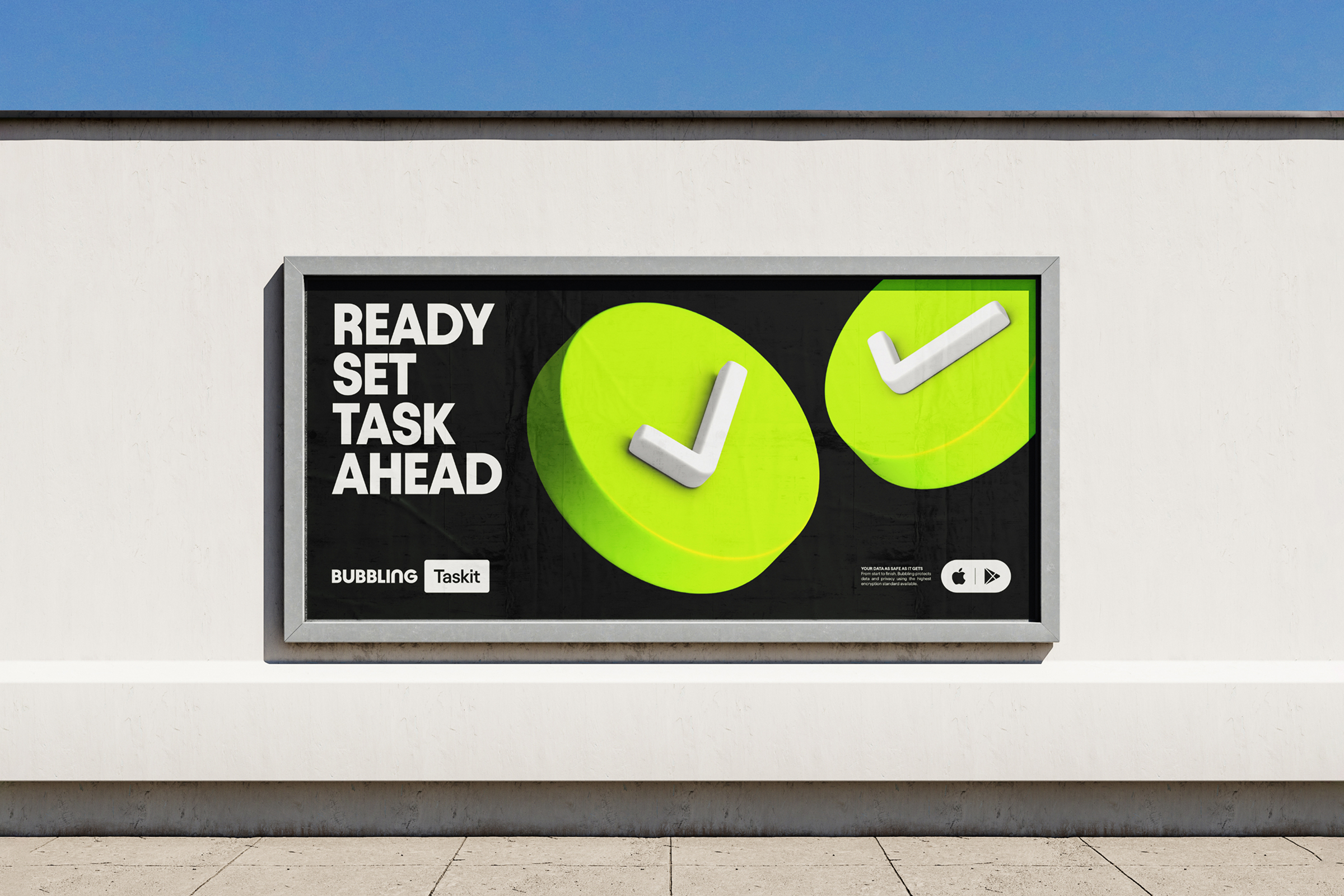
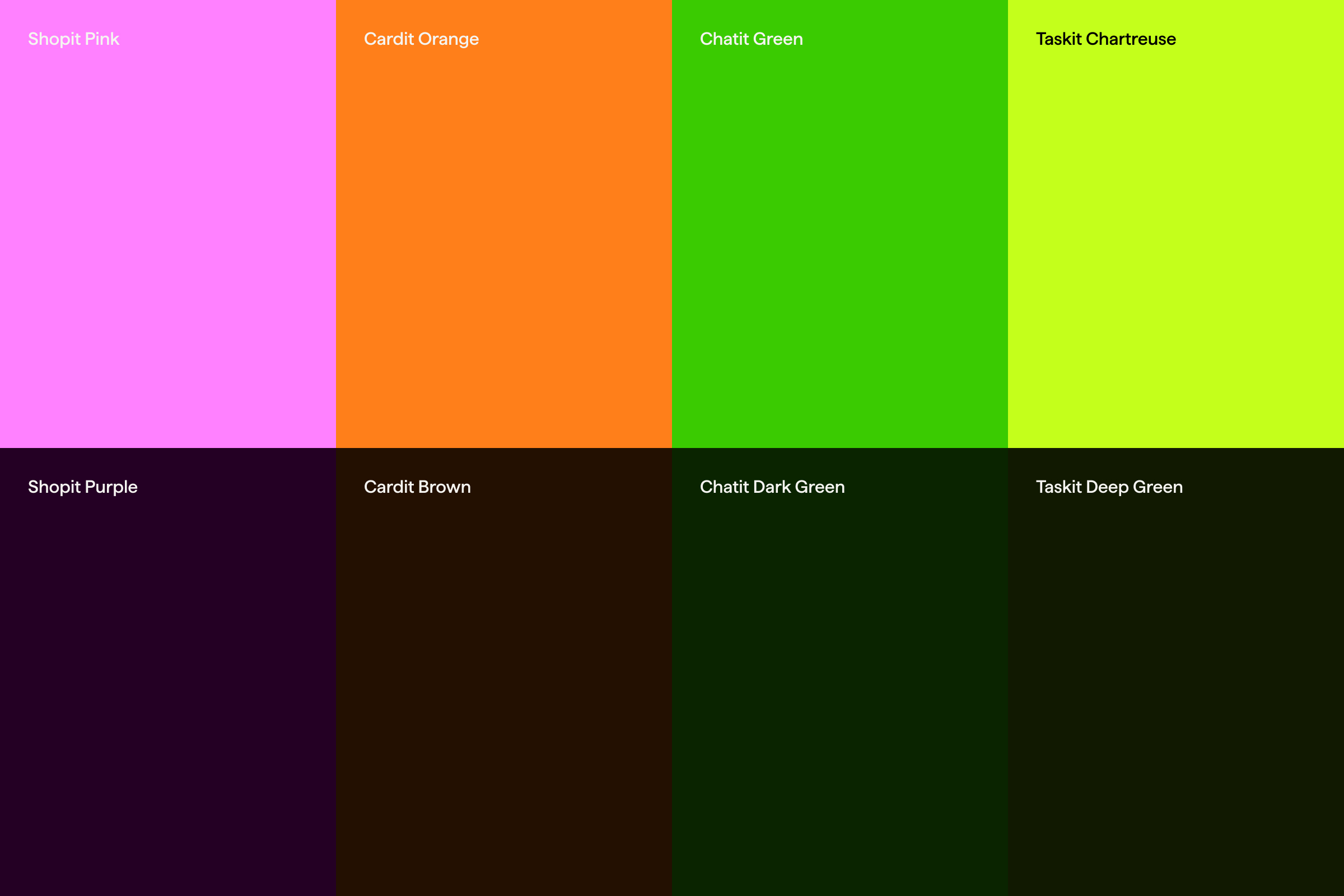
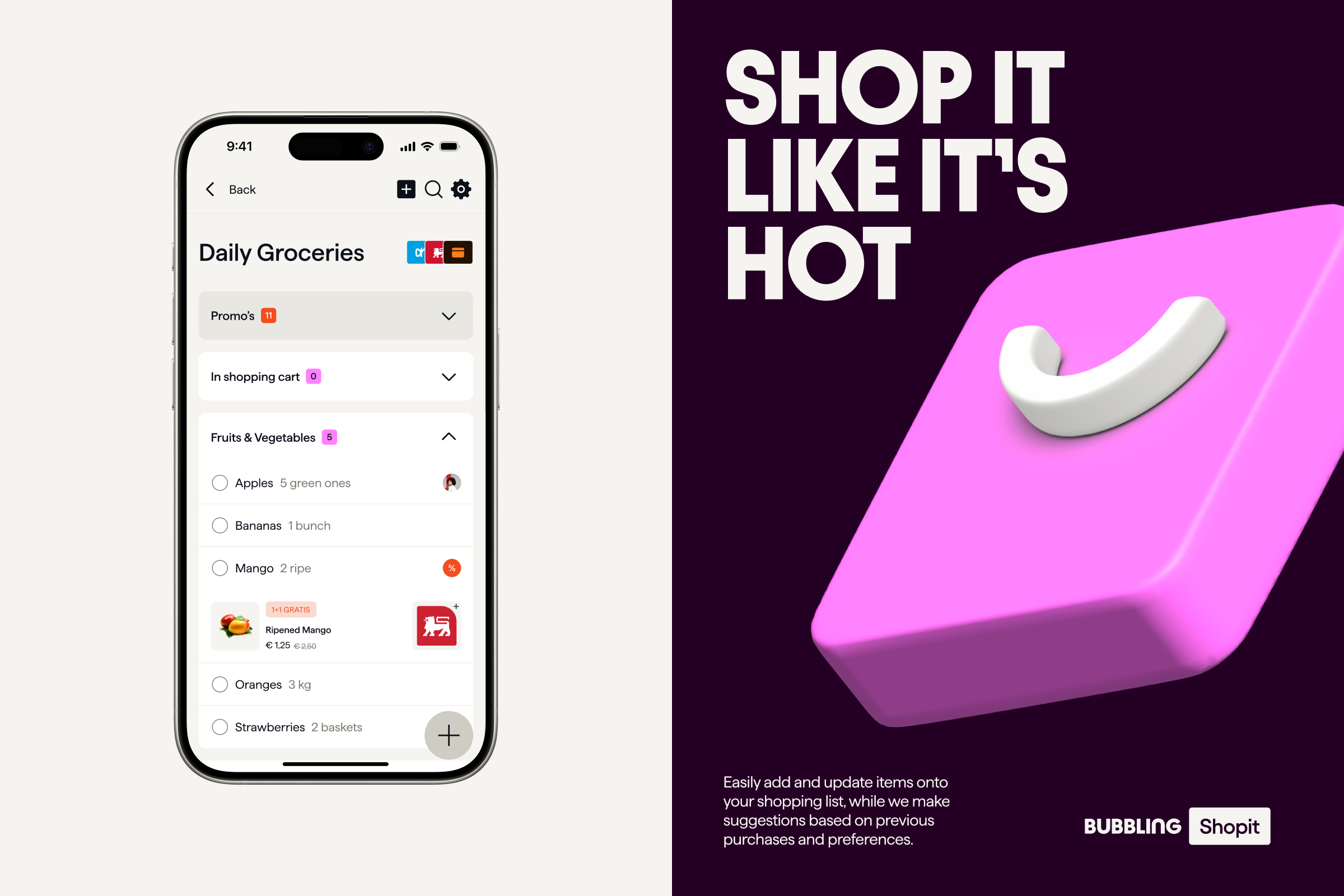
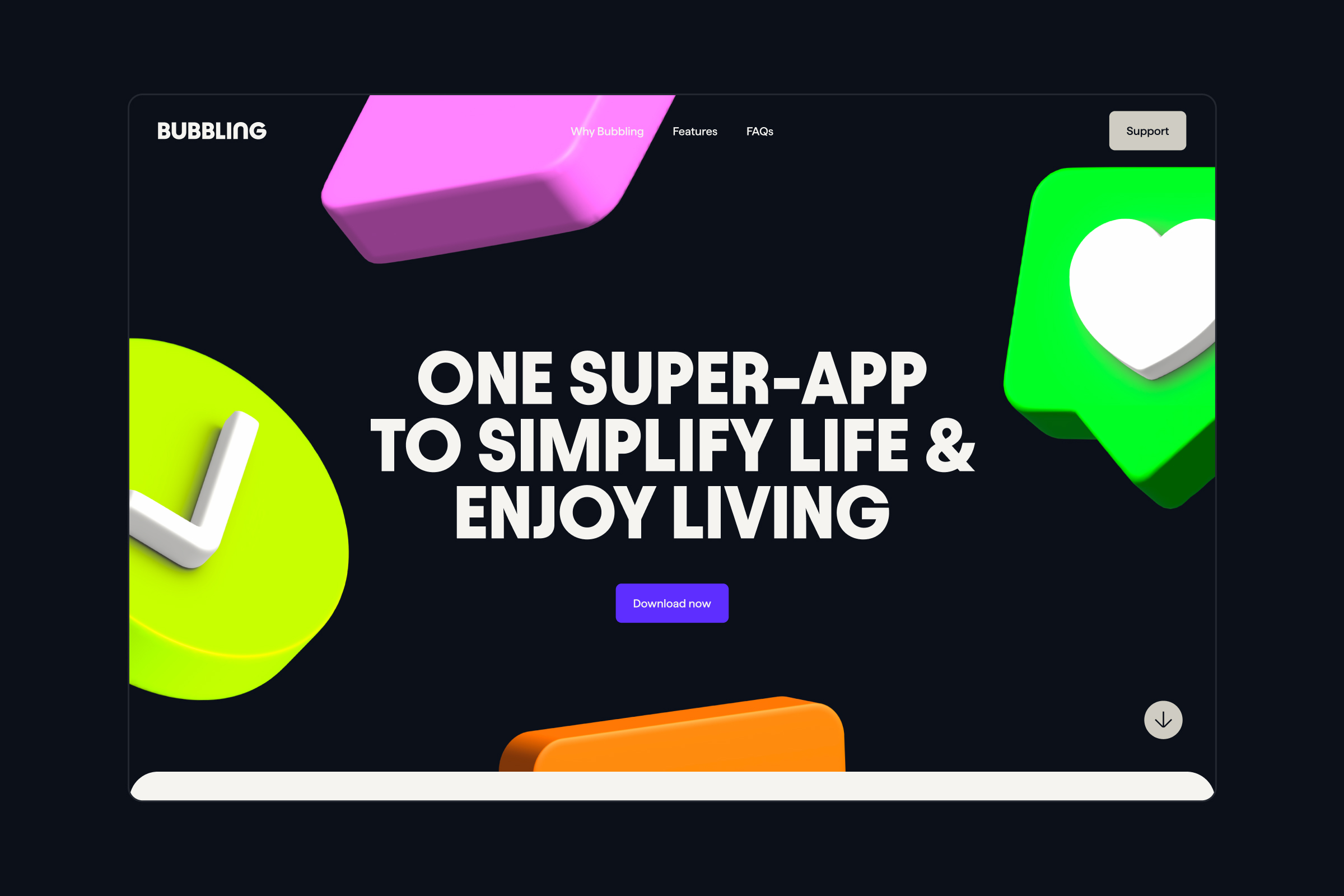
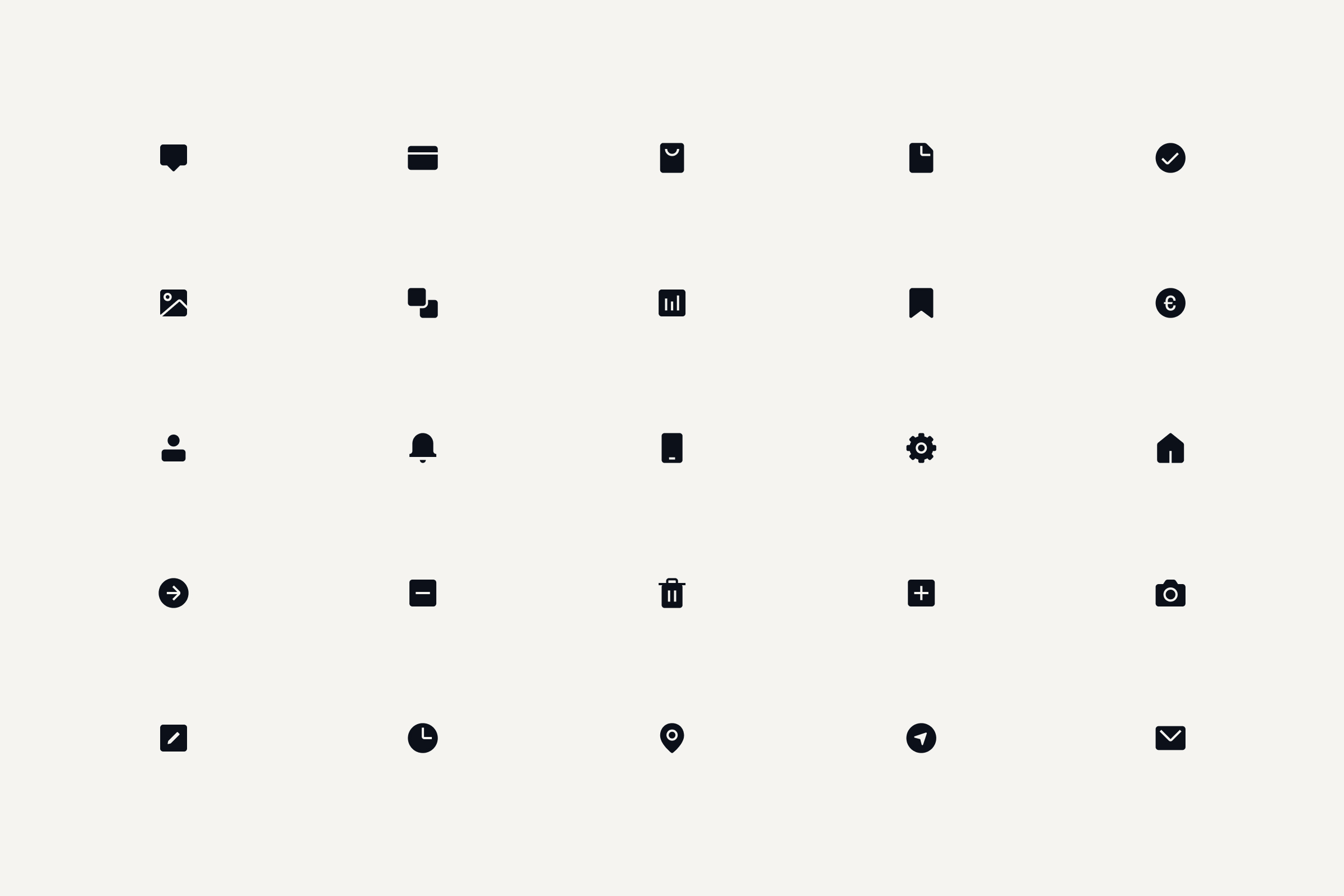
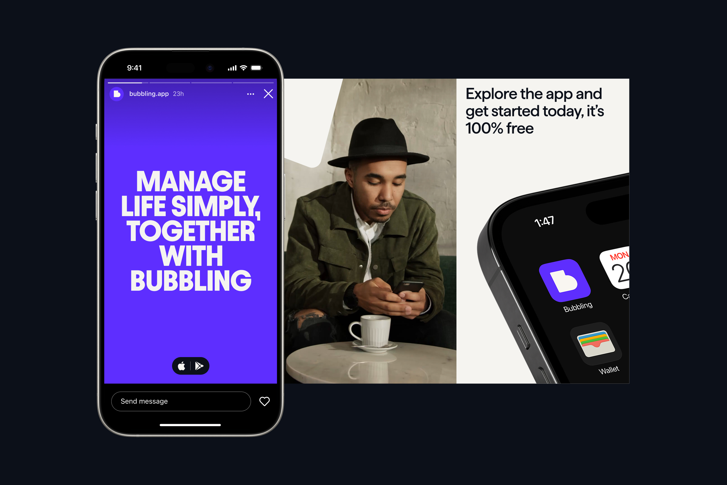
Bubbling is your go-to companion for streamlining everyday activities. By bringing a suite of tools into one cohesive platform, it helps people manage life with ease. with bubbling Everything happens in bubbles, all connected in one place. The identity reflects this idea through a humane and accessible visual language guided by four principles: happy, vivid, flexible, and bold. Bubbles form the cornerstone of the brand, creating a versatile design system that delivers a unified visual and narrative experience and evokes a trustworthy, inviting friendliness.
Services
Identity, Direction, Digital